I joined the project as a UX designer, working closely with the rest of the team as we created low-fidelity wireframes based on customer requirements. As the project progressed, I transitioned into the lead UI role while continuing to collaborate with UX to ensure alignment throughout.
Once the wireframes were approved, I owned the UI implementation. I developed a custom style guide rooted in the client's existing brand system and used it to bring the wireframes to life. I presented updated screens to the client weekly, walking them through key decisions and maintaining consistency across the experience.
Charlie is a transit app provided by Cubic for the city of Boston, with the goal of making the use of Boston transit systems less of a headache for its customers. The app allows the users to efficiently search and find the transit routes they need, while also allowing the user to add and maintain passes, payments, and cards. Making for a smoother overall transit experience. The team worked closely with the Massachusetts Bay Transit Authority (MBTA) to align the app with requirements set by the city of Boston, to best suit their transit customers.

Transit Mobile App
Charlie is a transit mobile app provided by Cubic for the city of Boston, with the goal of making the use of Boston transit systems less of a headache for its customers. The app allows the users to efficiently search and find the transit routes they need, while also allowing the user to add and maintain passes, payments, and cards. Making for a smoother overall transit experience.
The team worked closely with the Massachusetts Bay Transit Authority (MBTA) to align the app with requirements set by the city of Boston, to best suit their transit customers.

For this project, both UX and UI were completed in the same Figma file simultaneously. We had progress tabs on every flow to indicate where it was in the process. This set up made communication between teams and the customer extremely efficient, being able to quickly recall and reference flows and individual screens.
Setup.


Onboarding screens.


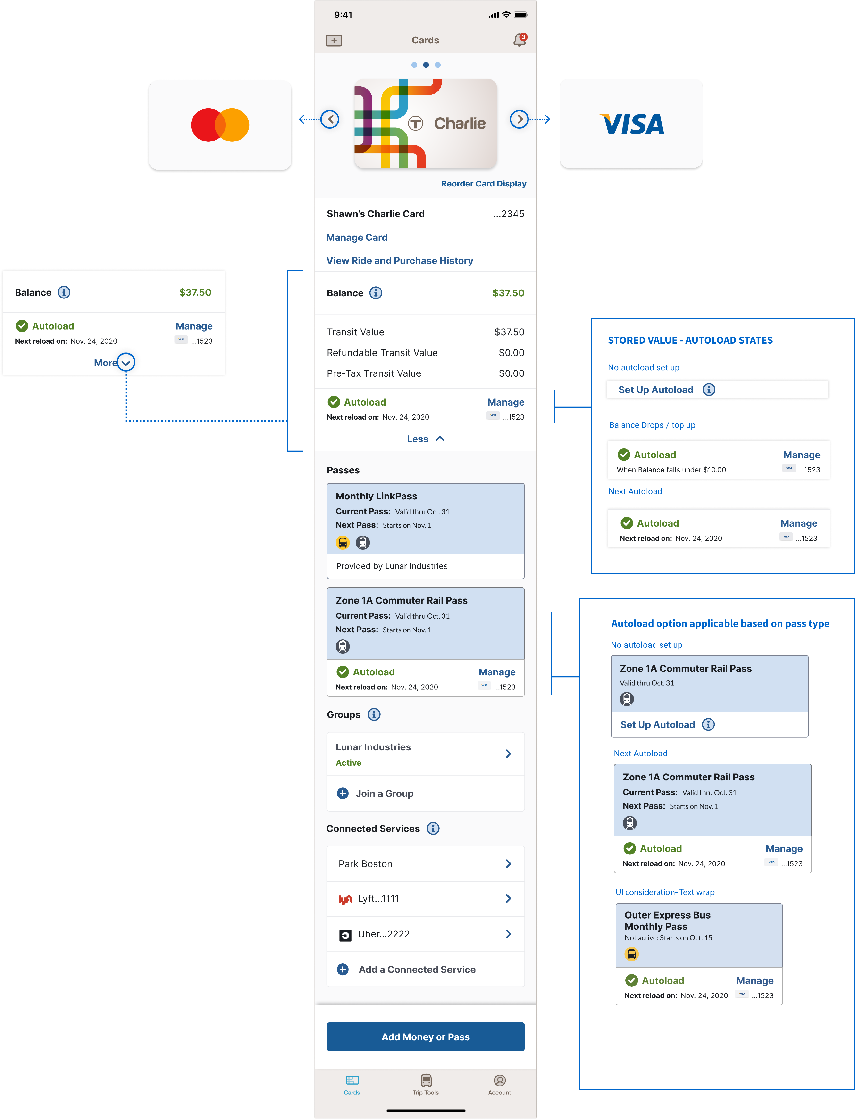
To help this screen be less overwhelming visually, the user can expand and collapse this balance section. When collapsed the user can still see the total balance on the card along with the card's autoload preference.
Autoload preferences are displayed on the bottom of each pass.
The card screen has a carousel at the top allowing the user to tap or slide through all cards on their account. Every time the user switches to a new card, that new card's information is populated through the rest of the screen.
Card screen.
Card screens continued.


Card screen.


